Student Success: Interactive Study Planner
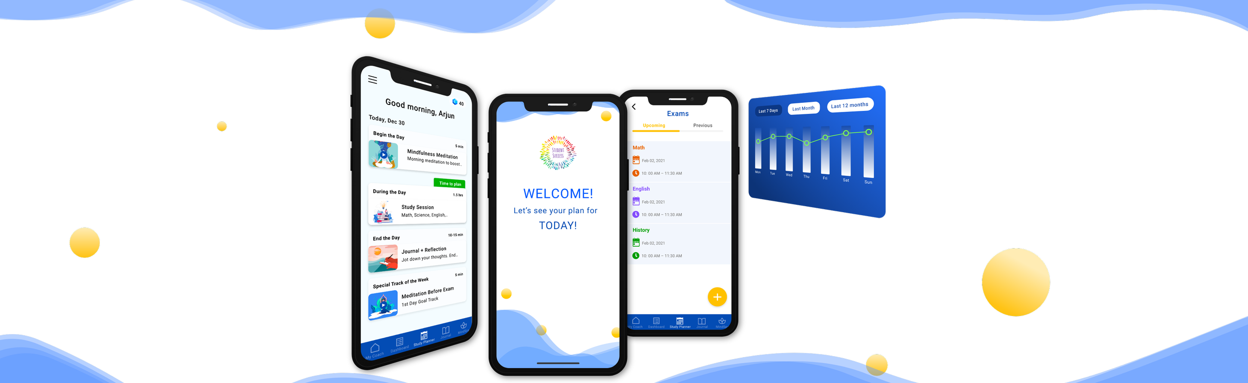
Mobile Study Planning Feature Design
Designed an intuitive study planning feature for nSmiles’ Student Success app, helping grades 8-12 students organize their academic lives while reducing stress and improving concentration.
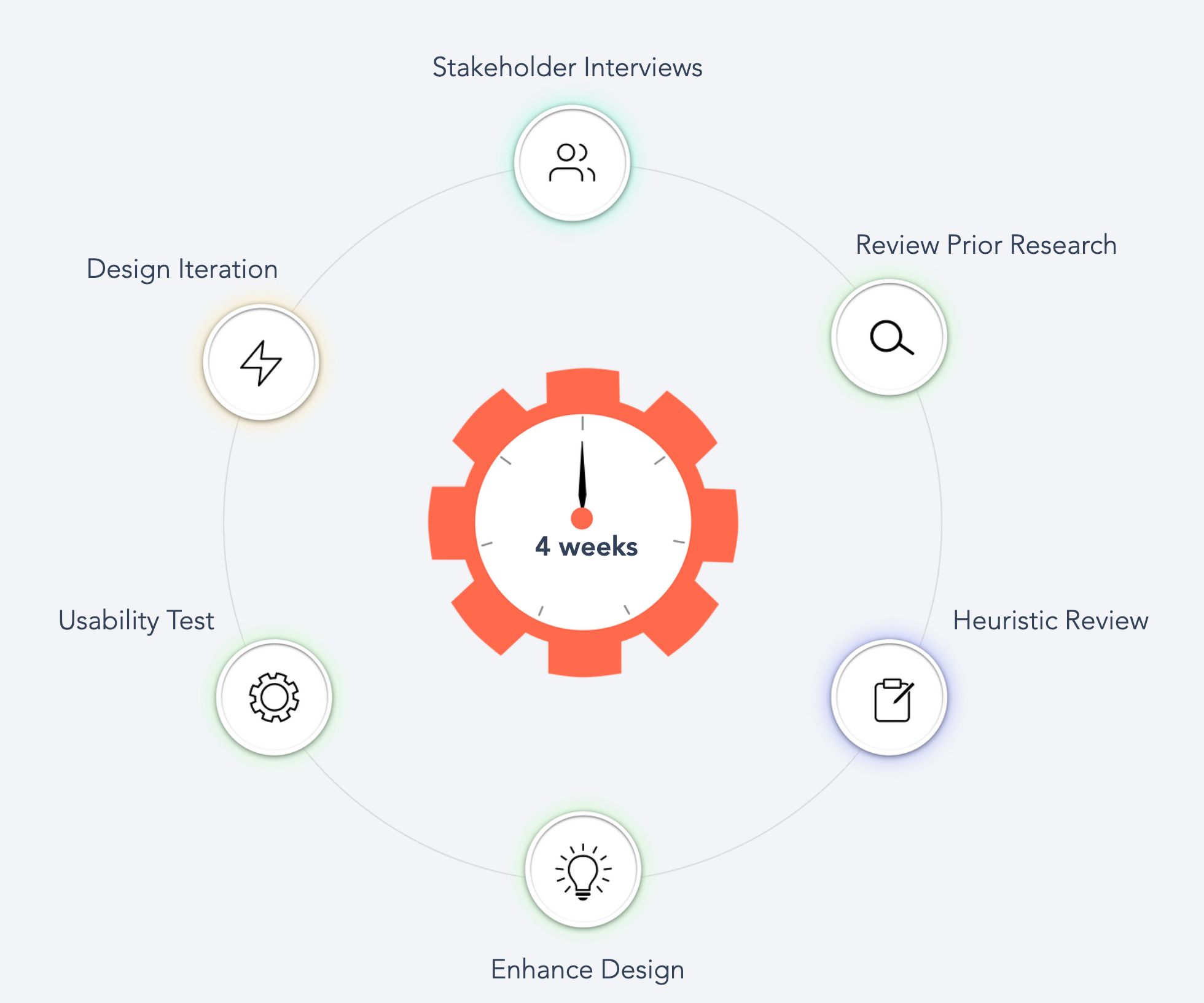
My Role: UX/UI Designer | 4 weeks | Solo Designer
Strategic Challenge
nSmiles wanted to expand their Student Success app beyond its existing features by introducing a comprehensive study planning tool. The challenge was creating an intuitive interface that would help students independently organize, plan, and conduct their studies while integrating seamlessly with the existing app ecosystem.
Early user feedback revealed confusion about the app’s purpose, with some users thinking it was about meditation rather than academic planning. This highlighted the need for clear feature positioning and intuitive design that would immediately communicate the study planning value proposition.
Research & Competitive Analysis
Understanding the Foundation
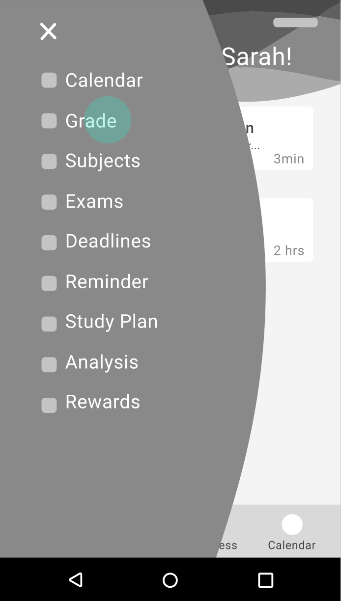
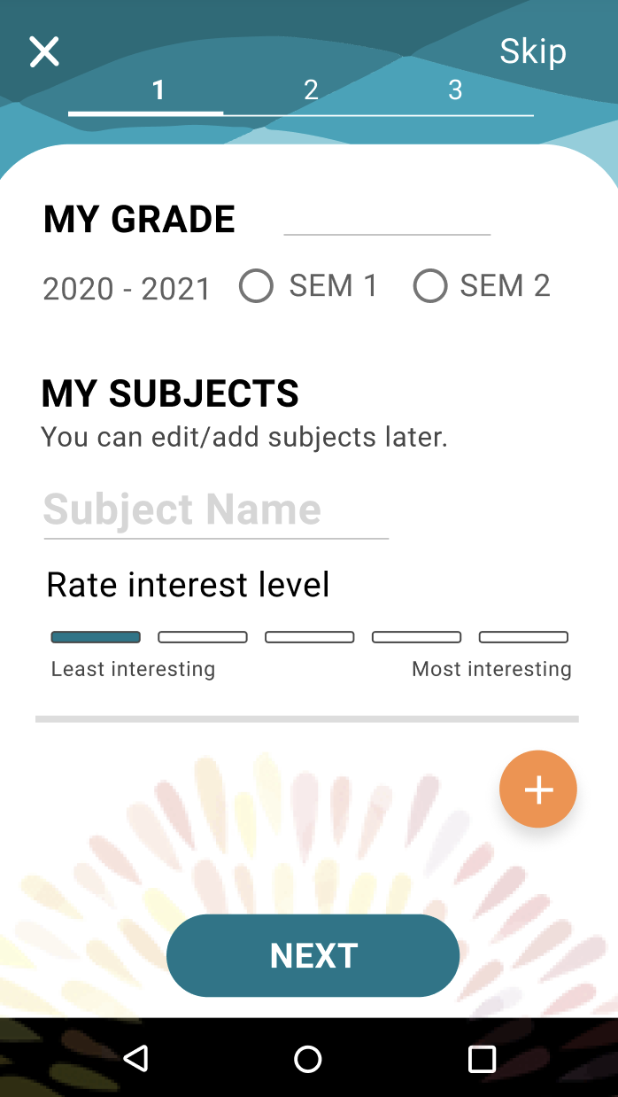
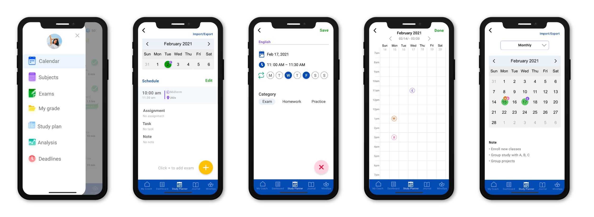
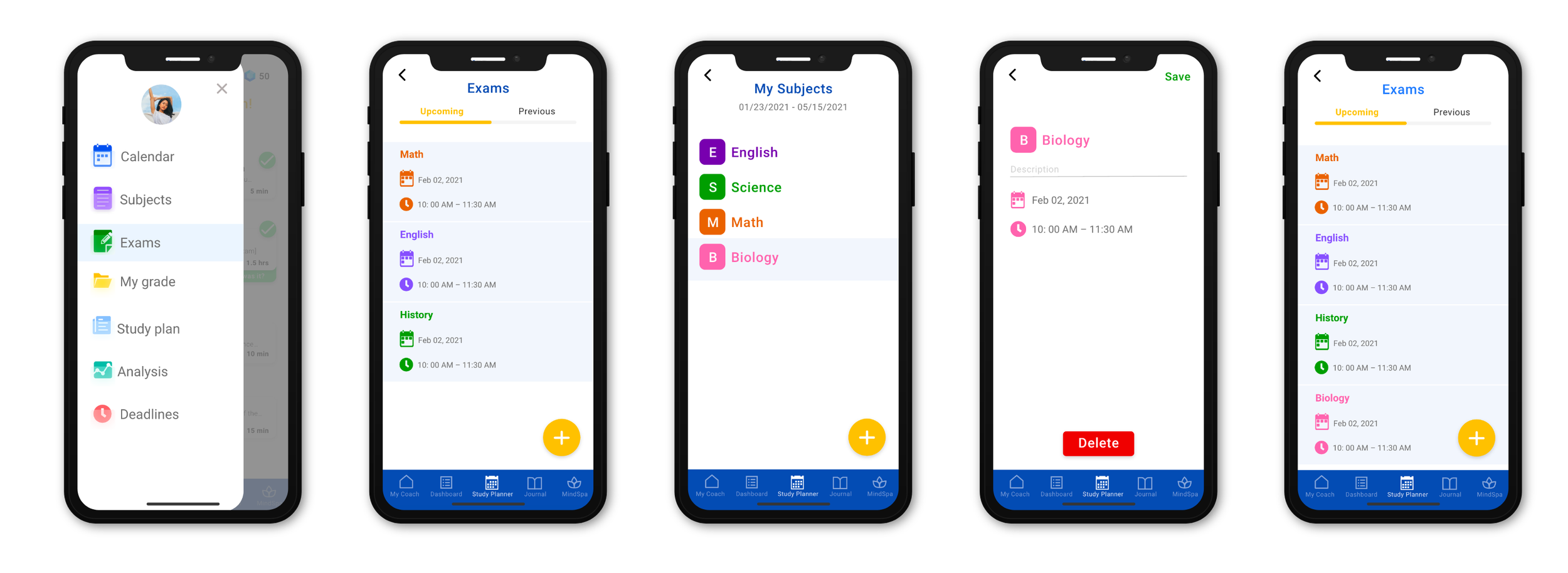
I began by interviewing the CEO and previous designers to understand the product vision and existing design strategies. Building on previous research and wireframes, I identified four critical user tasks: planning studies ahead of time, adding calendar events, checking study analysis, and organizing classes, assignments, and grades.
To gain firsthand experience, I signed up as a user and explored the existing app while reading through user reviews. This revealed the meditation confusion issue and confirmed the need for clearer feature communication within the broader Student Success ecosystem.
Competitive Landscape Research
I conducted a heuristic evaluation of four key competitors to understand the market landscape and identify design opportunities.
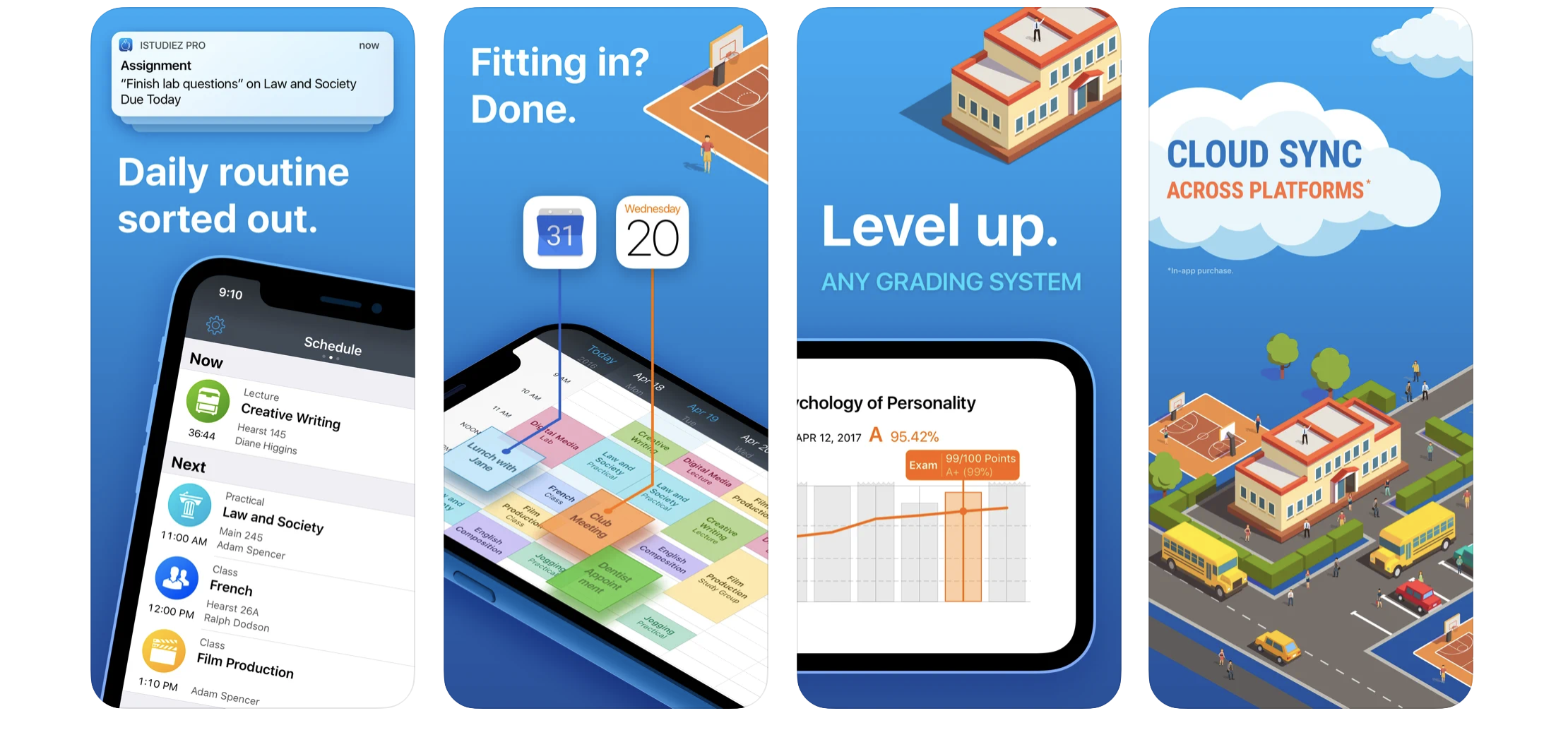
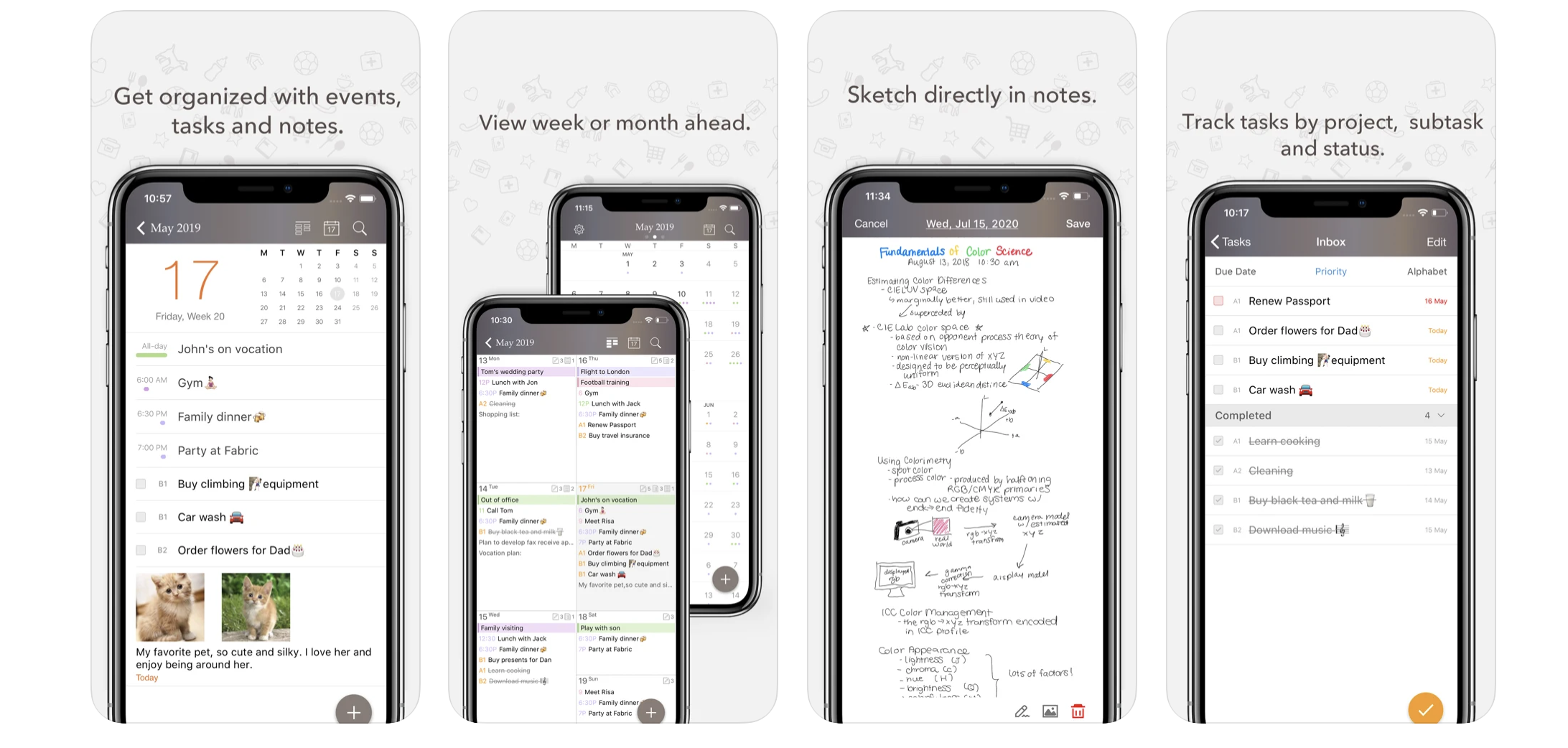
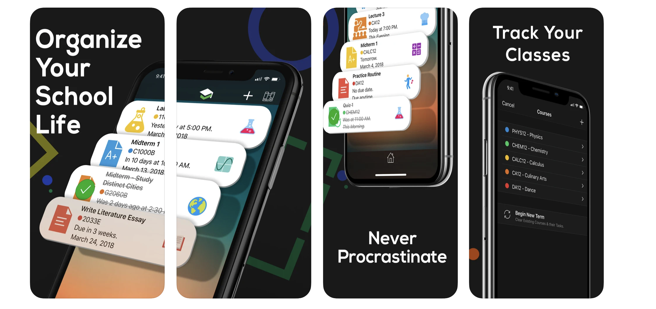
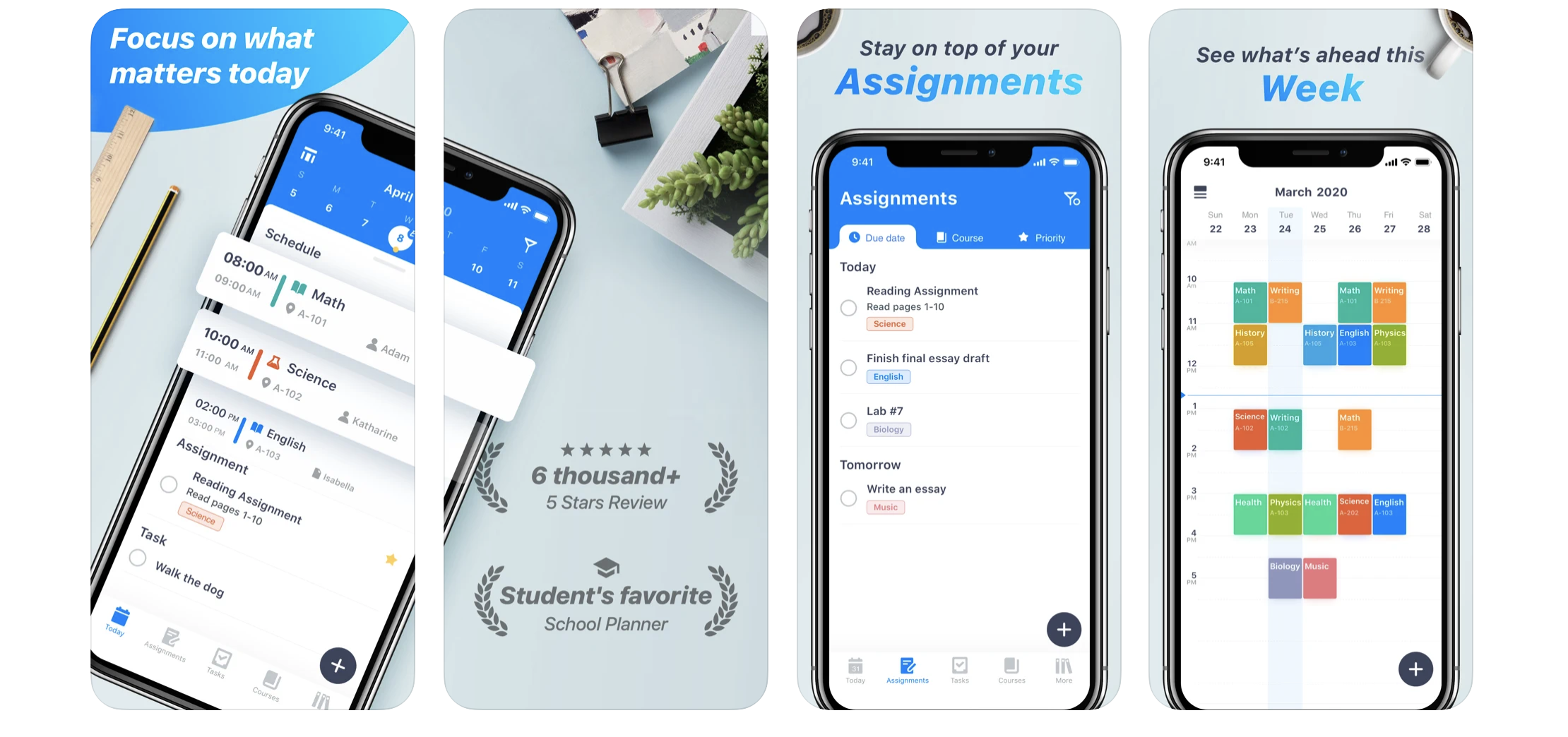
The competitive analysis revealed that most successful study planning apps focus on calendar-based interfaces with clean, minimalist design approaches. These apps prioritized aesthetic simplicity, clear system status visibility, user control, and consistent design standards. The findings showed that organized layouts with clear navigation consistently performed better for student users across different age groups.
Design Development & Prototyping
Building from Foundation Work
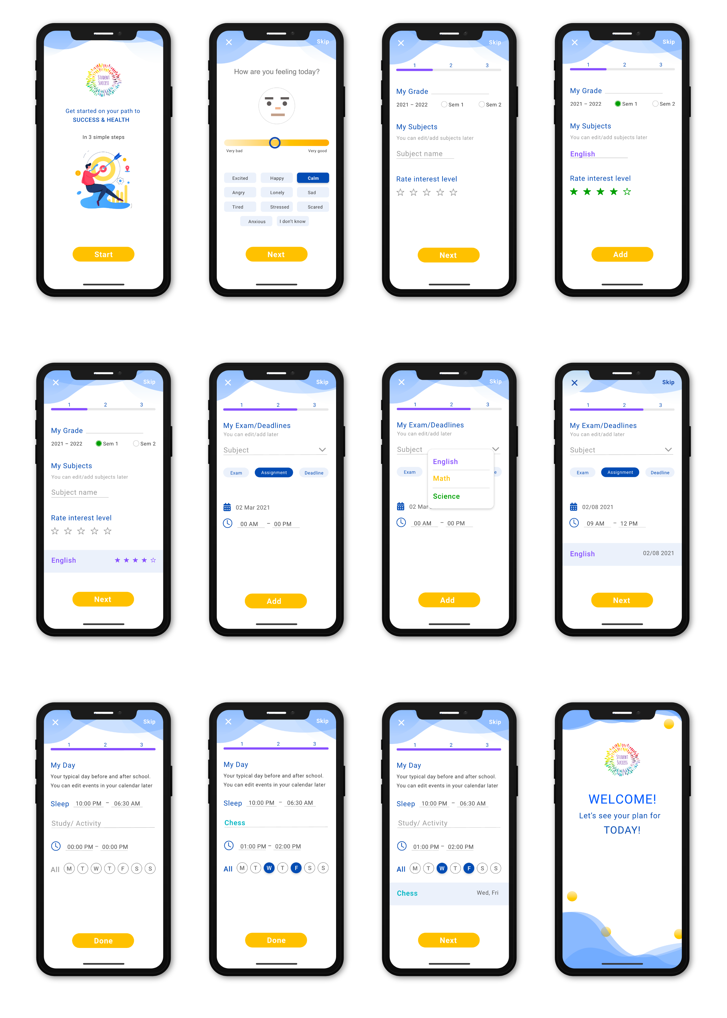
Working with the existing style guide, I synthesized insights from user reviews and competitive analysis to develop the initial high-fidelity prototype. The design process began with low-fidelity wireframes from a previous designer, which provided a solid foundation for the feature architecture.
Usability Testing & Validation
Testing with Student Users
I conducted usability testing with five students across grades 8-12 to validate the design effectiveness. Each 20-30 minute session used think-aloud methodology as students worked through the four core tasks.
Key Findings:
- Workflows are variable — Each user has a different process, with older students navigating more easily
- Lack of signifiers — Users were confused about elements without labels
- Unintuitive mental model — Users felt content was misplaced
Specific Pain Points:
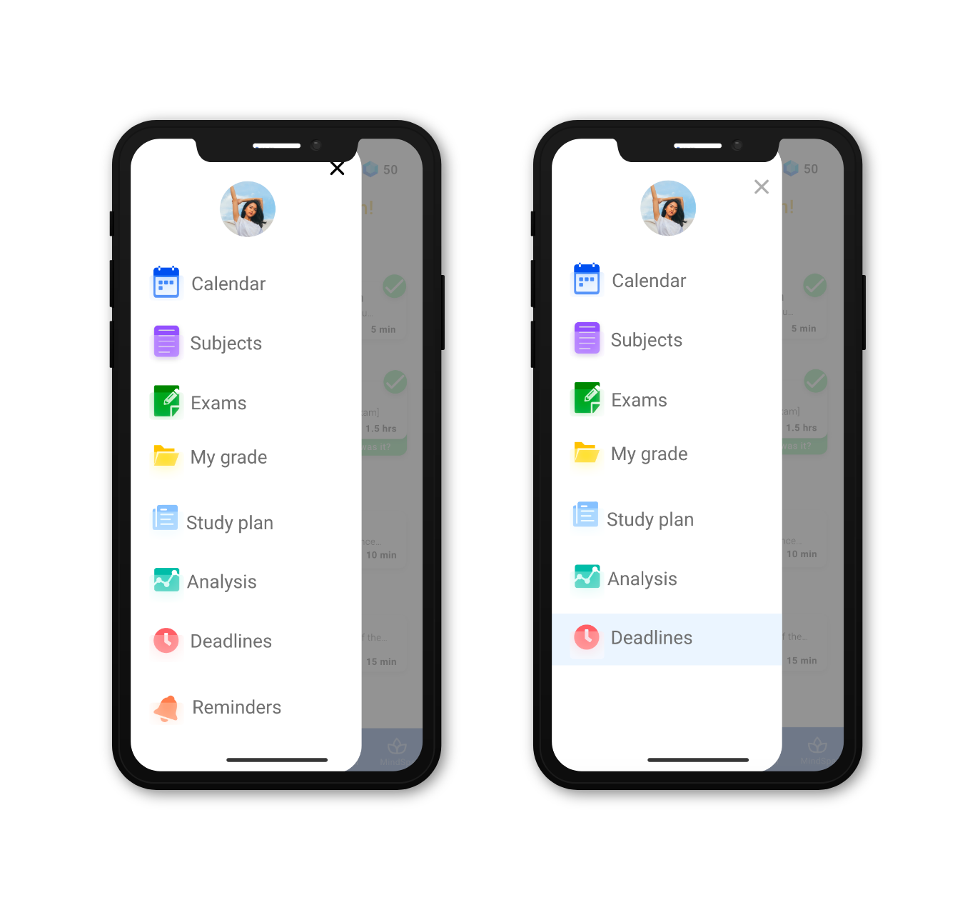
- Users were confused about the clock icon (class time vs. deadline)
- Users wanted to add notes to study sessions
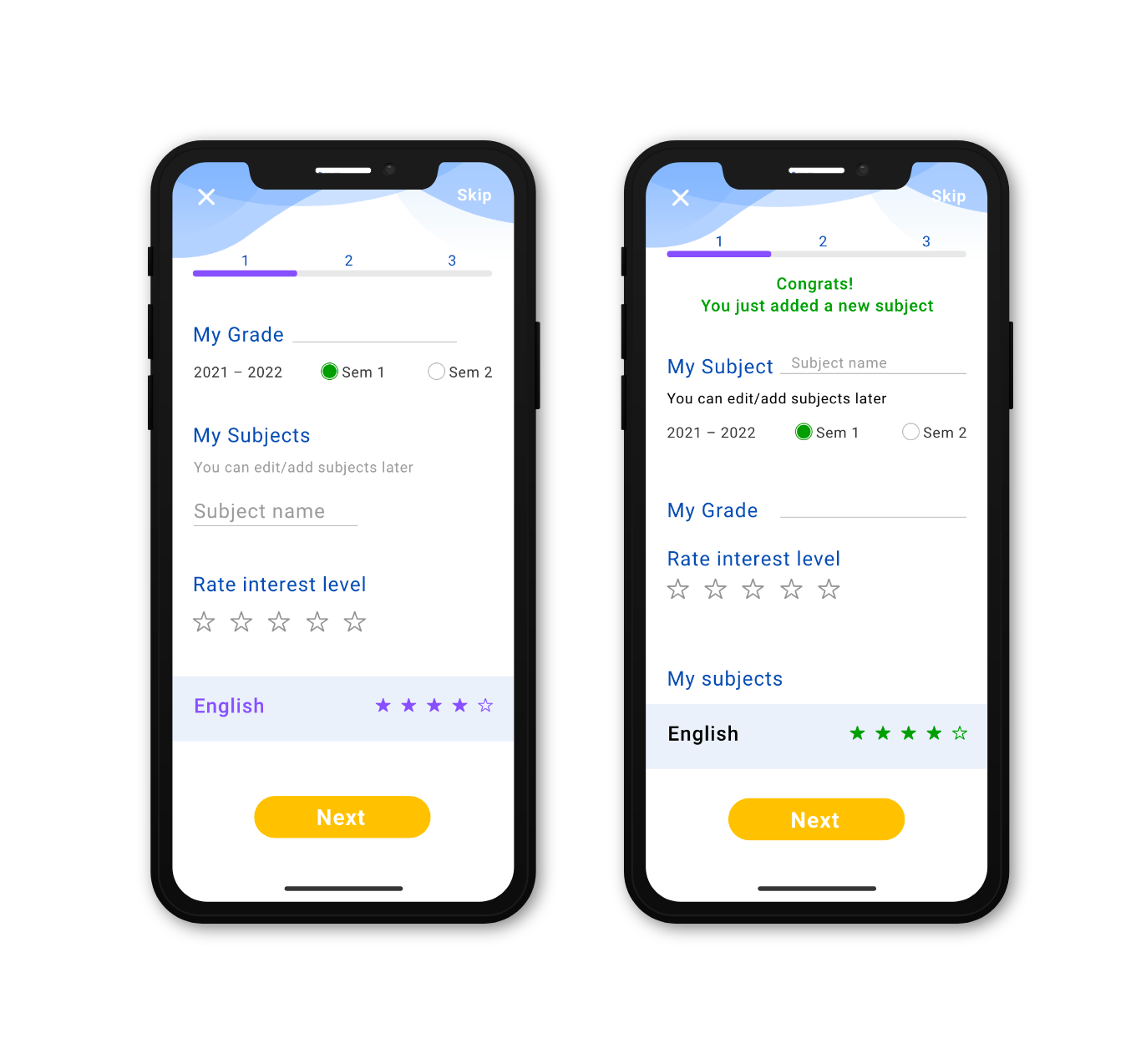
- Users expected “My Subject” before “My Grade” in the interface
- Users wanted feedback after completing tasks
- Users expected reminders grouped with deadlines
Design Iteration Based on Findings
The usability findings guided a focused iteration approach that prioritized the most critical issues affecting user comprehension and task completion.
Final Solution
The refined design addresses the core usability issues while maintaining consistency with the broader Student Success app ecosystem. The calendar-based interface provides familiar navigation patterns while the enhanced visual hierarchy and clearer labeling improve task completion rates across different student age groups.
Project Impact & Learning
This project demonstrated the importance of iterative design validation, particularly when designing for users across different developmental stages. The four-week timeline required strategic focus on priority tasks while maintaining design quality and stakeholder alignment.
The cross-timezone collaboration challenge, including 5 AM usability sessions, reinforced the value of flexible scheduling for inclusive user research. Most importantly, the testing process validated design assumptions and revealed user needs that wouldn’t have emerged through internal review alone.
This experience highlighted how thoughtful feature integration can expand an app’s value proposition while maintaining user experience consistency across a broader product ecosystem.